When the sun sets and the moon rises, this is where our journey begins.
The American Academy of Sleep Medicine sets the standards in sleep medical practices. The concept of the sun/moon derived from the circadian rhythm, which is the primary study in sleep medicine. Notice how the “S” (which stands for Sleep) is strategically placed between the sun setting and the moon rising. This logo was successfully pitched to the board of directors who were excited to move the company in a new direction and bring the sub specialty additional awareness throughout the nation.
Listed as GDUSA’s 2017 Health + Wellness Contest Winner
LUX Magazine 2018 United Kingdom Award Winner
PROBLEM
Rebrand company to represent new leadership and to gain respect in the field.
SOLUTION
Rebrand company with industry related concept and assist audience in identifying all subsidiaries/products.
OPPORTUNITY
Gain new members, enhance visibility and trust with respected associations, increase cross marketing junctures.
ROLE
- Graphic Design
- Art Direction
- Web Designer

Thought Process
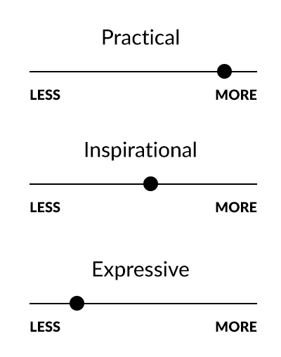
Brand Needs – While the company was undergoing new leadership and launching objectives in a new direction, there was a need to create a timeless mark with bold/professional typography which put us at the forefront of the field allowing us to gain trust and create new partnerships. Our keywords to visually represent included “sleep/professional/bold/modern”
Early attempts – Major difficulty revealed itself in the beginning as efforts went to gaining stakeholder trust to push the boundaries outside of our previous comfort zone. Slowing gaining buy in allowed the design team to shift creative direction to visual meet the goal of portraying the brand’s shift in direction.
Style – I wanted to lean away from an abstract mark and focus on typography as the company was launching a new simple URL which matched our acronyms. Developing art direction to focus on the universe to visually represent the circadian rhythm created a solid foundation to allow for creativity. The first step was to source a typeface which was bold and friendly. Next was to develop elements within the typography to put the “S” for “sleep” in the middle of the sun and moon. The logo needed to reveal the circadian rhythm and the importance of sleep and sleep health.


Pitch & Storytelling
As efforts went to gaining buy in from the executive staff, next was the board of directors. Overcoming the emotional attachment to the brand’s history and launching into a new future called for advanced story telling. Taking inspiration from Saul Bass’s 1969 AT&T brand pitch helped developed key talking points and a flow which guided the audience through the creative thought process. Review the full pitch.
One of my talented team members hustled to mock up 12 custom brand collateral for each board member. This allowed them to physically hold the future of the company’s brand in their hands.
Outcome
“When the sun sets and the moon rises, this is where our journey begins.” With an award winning brand, the company was able to create partnerships (including Google) and generate new audiences while representing an industry gold standard in its field.
Unified Brand
Mission: Advancing sleep care and enhancing sleep health to improve lives
Vision: Sleep is recognized as essential to health.
The AASM is advancing sleep care and enhancing sleep health to improve lives through accreditation, membership, practice standards & professional development. This brand was created with the intent to allow creativity within the flexible brand guidelines.
| Original | #0D5384 | #009BDE | #F99C25 | #FF6C0C |
| AA Normal Light text |
#0D5384 | #007cb2 | #aa6105 | #c74f00 |
| AAA Normal Light Text |
#0D5384 | #005e86 | #834b04 | #953b00 |
| AA Normal Dark text |
#137cc5 | #009BDE | #F99C25 | #FF6C0C |
Promotional
Directional
Informative